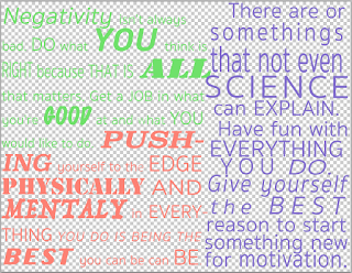
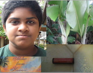
 The layer requirements are that you need 6 layers in total. The first 2 layers were supposed to be your quotes and manifesto. The other 4 were supposed to be your images, which were your portrait and 3 symbolic images. We also had to use the move tool wisely and arrange the images artistically. The text requirements are that you've got to kern the text so that there is no blank spaces or holes in the text. We also had to have a triadic color scheme on our text using the color wheel that was provided to us, 1 dominant color and 2 harmonious colors. Then we had to add effects to the text layer using option like stroke, drop shadow, bevel and emboss, glow and much more. For the images' effects you had to add thing like levels, curves, exposure and color balance.
 First I spent a lot of time kerning my text by choosing the word in my manifesto and quotes that really stood out to me. Then I had to choose specific fonts and sizings and much more to fit the specific word I kern. I also needed to make sure that the ALL the text was kerned and fit the page perfectly. After I was done with the tim consuming kerning, I uploaded my images. I started arranging the images after I uploaded them and then realized that I needed a triadic color scheme. So I went to the website that was provided to us to go find a color scheme. After I chose the color scheme I added it to the text and moved on. Then I added effects to my text so it can stand out and can be visible in front of the images. After, I added the exposure, brightness and contrast, levels and color balance to the images to get a turquoise color overlaying the images. Finally, I added some finishing touches like arranging the text layers and image layers for the last time, then I was finally DONE.
I think the biggest challenge was the kerning because we had to make sure that it looked good as well as make sure that it looked completely aligned at the edges. After which I had to arrange the images to fit the text perfectly. I also tried make the effects not block the text because we needed to see both the images and the text. I think the way I could improve it is by arranging the text better. The text could of looked more organized which could've gotten me an "A" instead of a "B".

No comments:
Post a Comment